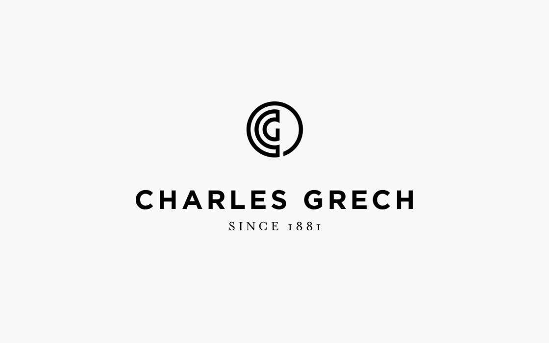
The Greek’s Key
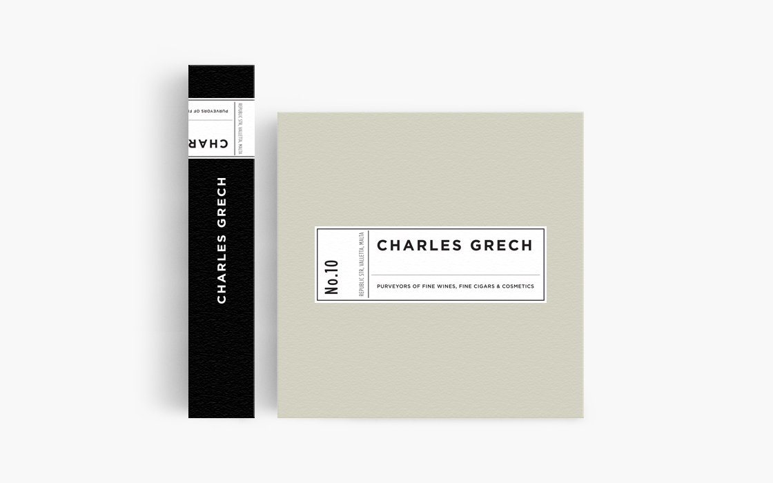
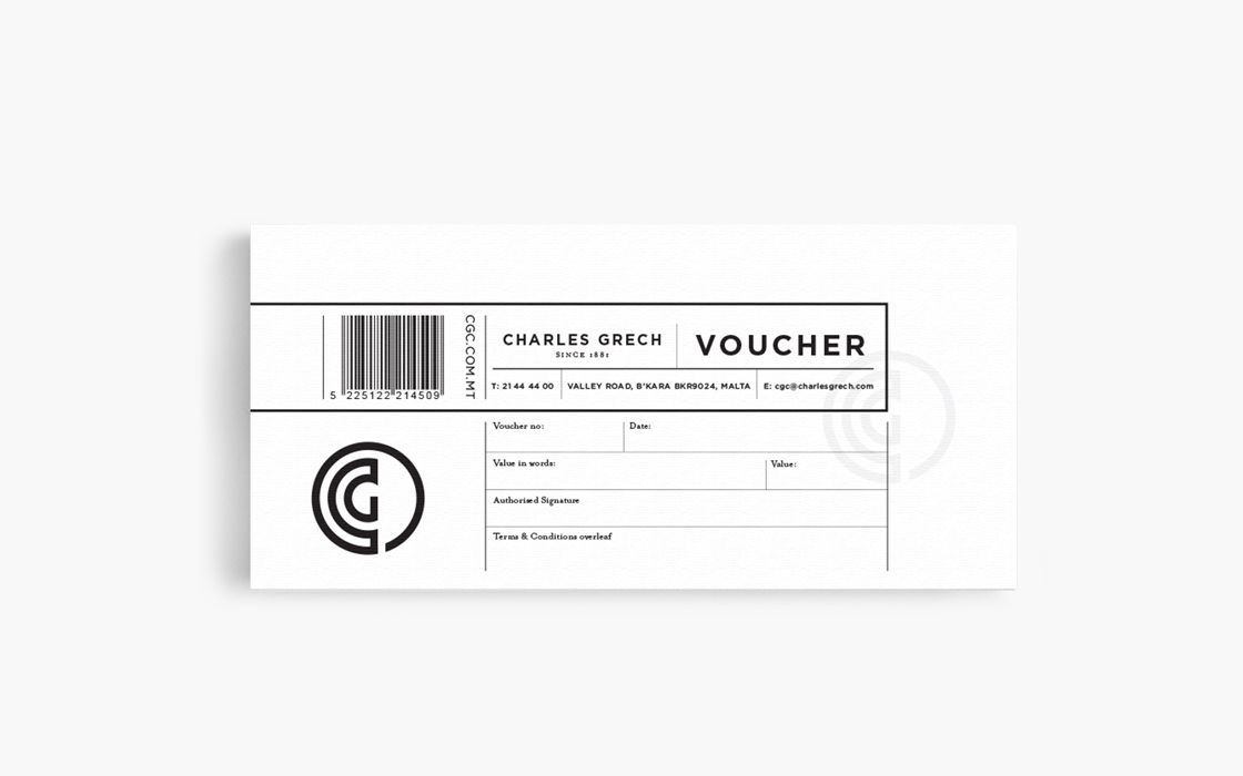
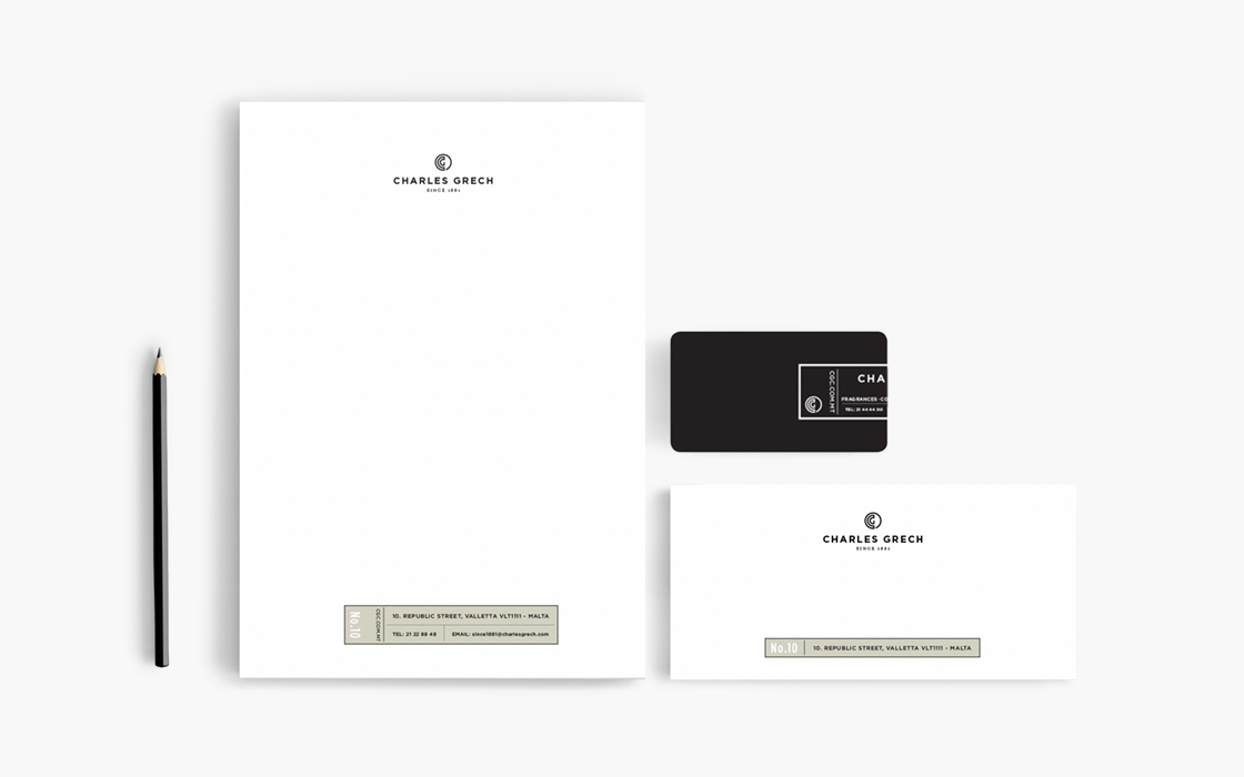
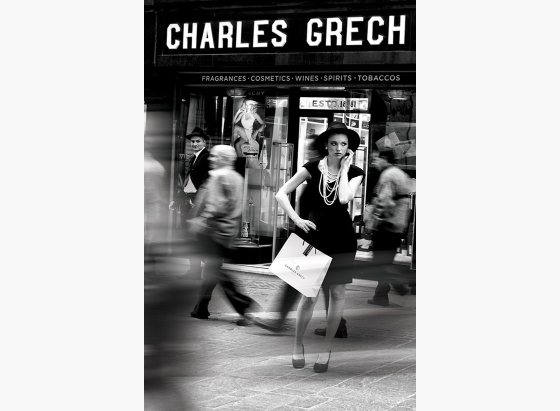
Since 1881 Charles Grech has been a leading importer of fine wines, beer and tobacco. In 2010 this range was extended to include include perfumes and cosmetics. With this product diversification and extensive refurbishment programme at their flagship store in Valletta, Mangion and Lightfoot were brought in to develop a brand image to support this. The challenge was to create an image that worked for the entire product portfolio and had enough stretch to accommodate future developments. The initial ideas for the logo came from the name Grech, which is derived from a Greek family who settled on the island of Malta in the 17th century. Research into Greek designs and motifs inspired the combination of ‘C’ and a ‘G’ in a continuous line that became the logo; a simple interpretation of the Greek key design. We also created a separate graphic device to help position the brand as upmarket and well-established. Ultimately the two elements work together and can be easily applied across the full range of products.
In the ad campaign we created a nostalgic vignette of 50s Valletta to further emphasise the brand elements and aspirational quality. The shop facade itself although extensively restored, was not changed from its original design and we felt that cigars, fine wines and even cosmetics fitted perfectly with the 50s theme.